I have used LVGL when doing embedded work, and its style system left a deep impression on me. LVGL’s Border is “solid” - it will occupy the layout space and squeeze the content inside.
Android is not so happy here. The borders of ShapeDrawable and MaterialCardView are more like “decorations”. Do you want the borders, rounded corners, and padding to be independently controllable? Native components are quite awkward to make.
So I simply made a BorderFrameLayout and transferred the logic of LVGL.
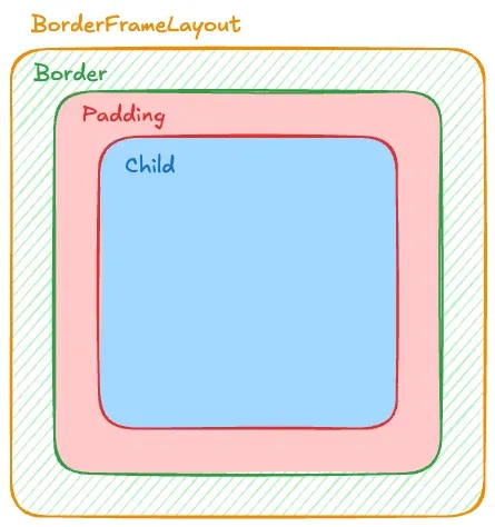 The different colors in the picture represent the actual occupied space.
Green represents Border, red represents internal Padding, and blue represents available space for Child.
The different colors in the picture represent the actual occupied space.
Green represents Border, red represents internal Padding, and blue represents available space for Child.
Several pitfalls of the native solution
To add a border to a View, the conventional approach is to write shape XML and set it to background. But in actual use, you will encounter these problems:
Rounded corner quilt View covers: The container has rounded corners, and when the sub-View has different colors, it will directly cover the rounded corners. OutlineProvider and clipToOutline work, but the effect is unstable.
Padding and Border are mixed together: If you want to achieve “Border accounts for 2dp, Padding accounts for 10dp”, you have to calculate the addition yourself. Once the logic is complex, it is easy to make mistakes.
Trouble with independent control of each side: Just want the bottom border? Want dotted lines? The XML solution requires writing a bunch of files.
Idea: Inherit FrameLayout and override drawing
Since the native one doesn’t work, then do it yourself.
BorderFrameLayout Split the container boundary into two layers:
- Background Path: The outer outline of the entire control (including rounded corners)
- Child Draw Area: After deducting the border, the actual available area of the child View
The Border is drawn between these two layers.
Effect display
In order to facilitate the demonstration effect, I placed a bottom-aligned Button inside the BorderFrameLayout. The position of this Button will be affected by changes in the size and position of the Border and will be offset.
Bottom border only
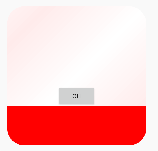 You can see that the bottom of the Button is the bottom Border, not the bottom of the regular container.
Right and bottom bezel (L-shaped)
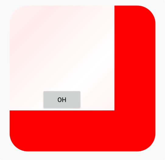 With the introduction of the right Border, the Button is slightly offset from what it should be.
Dotted border on the top, right and bottom sides
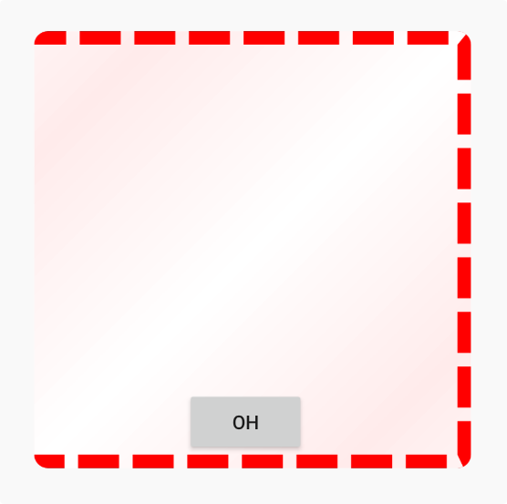 Dotted line Border effect display
Extreme rounded corners
 When the Border fillet is set to be very large and the Border is missing one edge, we get this
It looks like a very weird effect, but it is indeed a style that can be set in LVGL.
When the Border fillet is set to be very large and the Border is missing one edge, we get this
It looks like a very weird effect, but it is indeed a style that can be set in LVGL.
Single edges, multiple edges, dashed lines, and extreme rounded corners can all be handled correctly.
Implementation details
1. Let Border participate in layout calculations
Overload onLayout and layoutChildren, and count mBorderWidth into the child View’s available space:
private fun layoutChildren(left: Int, top: Int, right: Int, bottom: Int) {
    // parentLeft 等边界基于 (padding + border) 计算
    val parentLeft: Int = getPaddingLeftWithForeground()
    val parentRight: Int = right - left - getPaddingRightWithForeground()

    val parentTop: Int = getPaddingTopWithForeground()
    val parentBottom: Int = bottom - top - getPaddingBottomWithForeground()

    for (i in 0 until count) {
        val child = getChildAt(i)
        // 子 View 会被"挤"到 Border 内部
        child.layout(childLeft, childTop, childLeft + width, childTop + height)
    }
}
getPadding returns mRealPadding + mBorder, making the Android system think that this is normal Padding:
override fun getPaddingLeft(): Int {
    return (mRealPaddingLeft + mBorderLeft).roundToInt()
}
2. Draw Border with mask
At first I tried using Path + Stroke to shrink the border. But in the multi-sided + extreme rounded corner scenario, it is difficult to keep the inner and outer contours consistent. The dashed lines are especially noticeable around corners.
If you draw a Stroke rectangle directly, it will be difficult to align the inner and outer arcs of the rounded corners. So in the end, the PorterDuffXfermode masking scheme was used:
- Draw a completely black rounded outline
- Use
DST_OUTto deduct the middle content area - Get a Mask with only border shape
- Use
SRC_INto fill in the Border color
val maskBitmap = Bitmap.createBitmap(width, height, Bitmap.Config.ALPHA_8)
val maskCanvas = Canvas(maskBitmap)

// 填充外轮廓
maskCanvas.drawPath(mBackgroundPath, mBorderPaint.apply {
    style = Paint.Style.FILL
    color = Color.BLACK
})

// 扣掉内部区域
mBorderPaint.xfermode = PorterDuffXfermode(PorterDuff.Mode.DST_OUT)
maskCanvas.drawPath(generateChildDrawAreaPath(), mBorderPaint)

// 用 Mask 限制 Border 绘制范围
canvas.drawBitmap(maskBitmap, 0f, 0f, mBorderPaint)
mBorderPaint.xfermode = PorterDuffXfermode(PorterDuff.Mode.SRC_IN)
canvas.drawRect(0f, 0f, width.toFloat(), height.toFloat(), mBorderPaint.apply {
    this.color = mBorderColor
})
No matter how wide the Border is or how exaggeratedly rounded the corners are, the edges will always be aligned.
3. dashed border
Add a layer of DashPathEffect in the Mask stage:
if (mBorderStyle == 1) {
    counterPath.addRoundRect(/* 中间轮廓 */)
    maskCanvas.drawPath(counterPath, mBorderPaint.apply {
        style = Paint.Style.STROKE
        pathEffect = DashPathEffect(
            floatArrayOf(maxDashIntervals, maxDashIntervals * 3),
            0f
        )
    })
}
4. Content cropping
Prevent subviews from covering rounded corners:
override fun dispatchDraw(canvas: Canvas) {
    drawBorderAndBackground(canvas)
    canvas.save()
    if (clipContent) {
        canvas.clipPath(mBackgroundPath)
        canvas.clipPath(generateChildDrawAreaPath())
    }
    super.dispatchDraw(canvas)
    canvas.restore()
}
This solution will have a certain Bitmap reconstruction overhead when Border changes frequently. More suitable for container components with stable styles.
XML declarative usage
After defining custom attributes, you can use them directly in the layout:
<?xml version="1.0" encoding="utf-8"?>
<resources>
    <declare-styleable name="BorderFrameLayout">
        <attr name="borderRadius" format="dimension" />
        <attr name="borderWidth" format="dimension" />
        <attr name="borderLeft" format="dimension" />
        <attr name="borderTop" format="dimension" />
        <attr name="borderRight" format="dimension" />
        <attr name="borderBottom" format="dimension" />
        <attr name="borderColor" format="color" />
        <attr name="borderStyle" format="enum">
            <enum name="solid" value="0" />
            <enum name="dash" value="1" />
        </attr>
        <attr name="backgroundGradientAngle" format="float" />
        <attr name="backgroundGradientColor" format="color" />
        <attr name="realPaddingLeft" format="dimension" />
        <attr name="realPaddingTop" format="dimension" />
        <attr name="realPaddingRight" format="dimension" />
        <attr name="realPaddingBottom" format="dimension" />
        <attr name="backgroundColor" format="color" />
        <attr name="clipContent" format="boolean" />
    </declare-styleable>
</resources><io.serialflow.editor.ui.BorderFrameLayout
android:layout_width="200dp"
android:layout_height="200dp"
app:borderRadius="24dp"
app:borderWidth="8dp"
app:borderColor="#FF0000"
app:borderStyle="dash"
app:backgroundColor="#FFEEEE"
app:clipContent="true">
<!-- 子 View 会被自动挤到边框内部 -->
</io.serialflow.editor.ui.BorderFrameLayout>Complete code
package io.serialflow.editor.ui

import android.content.Context
import android.graphics.\*
import android.util.AttributeSet
import android.view.Gravity
import android.widget.FrameLayout
import kotlin.math.PI
import kotlin.math.cos
import kotlin.math.roundToInt
import kotlin.math.sin
import io.serialflow.editor.R

class BorderFrameLayout : FrameLayout {

    private val DEFAULT_CHILD_GRAVITY = Gravity.TOP or Gravity.START
    protected var clipContent: Boolean = true

    private var mBackgroundPath = Path()
    private var mBorderInnerContourPath = Path()

    private var mBorderRadius = 0f
    private var mBorderWidth: Float = 0f

    private var mBorderLeft: Float = 0f
    private var mBorderTop: Float = 0f
    private var mBorderRight: Float = 0f
    private var mBorderBottom: Float = 0f

    private var mRealPaddingLeft: Float = 0f
    private var mRealPaddingTop: Float = 0f
    private var mRealPaddingRight: Float = 0f
    private var mRealPaddingBottom: Float = 0f

    private val mBorderPaint = Paint().apply {
        isAntiAlias = true
        style = Paint.Style.FILL
    }

    private var mBorderColor: Int = Color.TRANSPARENT
    private var mBorderStyle: Int = 0
    private var mBackgroundColor: Int = Color.TRANSPARENT
    private var mBackgroundGradientAngle = 0f
    private var mBackgroundGradientColor = Color.TRANSPARENT
    private val counterPath = Path()

    constructor(context: Context) : this(context, null)
    constructor(context: Context, attrs: AttributeSet?) : this(context, attrs, 0)
    constructor(context: Context, attrs: AttributeSet?, defStyle: Int) : super(
        context, attrs, defStyle
    ) {
        val typedArray = context.obtainStyledAttributes(attrs, R.styleable.BorderFrameLayout, defStyle, 0)

        mBorderRadius = typedArray.getDimension(R.styleable.BorderFrameLayout_borderRadius, 0f)
        mBorderColor = typedArray.getColor(R.styleable.BorderFrameLayout_borderColor, Color.TRANSPARENT)
        if (mBorderColor != Color.TRANSPARENT) {
            mBorderColor = mBorderColor or 0xff000000.toInt()
        }
        mBorderStyle = typedArray.getInt(R.styleable.BorderFrameLayout_borderStyle, 0)

        mBackgroundColor = typedArray.getColor(R.styleable.BorderFrameLayout_backgroundColor, Color.TRANSPARENT)
        mBackgroundGradientAngle = typedArray.getFloat(R.styleable.BorderFrameLayout_backgroundGradientAngle, 0f)
        mBackgroundGradientColor = typedArray.getColor(R.styleable.BorderFrameLayout_backgroundGradientColor, Color.TRANSPARENT)
        clipContent = typedArray.getBoolean(R.styleable.BorderFrameLayout_clipContent, true)

        mRealPaddingLeft = typedArray.getDimension(R.styleable.BorderFrameLayout_realPaddingLeft, 0f)
        mRealPaddingTop = typedArray.getDimension(R.styleable.BorderFrameLayout_realPaddingTop, 0f)
        mRealPaddingRight = typedArray.getDimension(R.styleable.BorderFrameLayout_realPaddingRight, 0f)
        mRealPaddingBottom = typedArray.getDimension(R.styleable.BorderFrameLayout_realPaddingBottom, 0f)

        val borderWidth = typedArray.getDimension(R.styleable.BorderFrameLayout_borderWidth, 0f)
        val borderLeft = typedArray.getDimension(R.styleable.BorderFrameLayout_borderLeft, borderWidth)
        val borderTop = typedArray.getDimension(R.styleable.BorderFrameLayout_borderTop, borderWidth)
        val borderRight = typedArray.getDimension(R.styleable.BorderFrameLayout_borderRight, borderWidth)
        val borderBottom = typedArray.getDimension(R.styleable.BorderFrameLayout_borderBottom, borderWidth)

        typedArray.recycle()
        setBorderWidth(borderLeft, borderTop, borderRight, borderBottom)
    }

    // ... 完整代码见项目源码 ...

}
The source code is availableBorderFrameLayout.kt